✦ TrafficMaxxing · Done-For-You Content Engine
More Money.
More Money.
More Choices.
TrafficMaxxing.
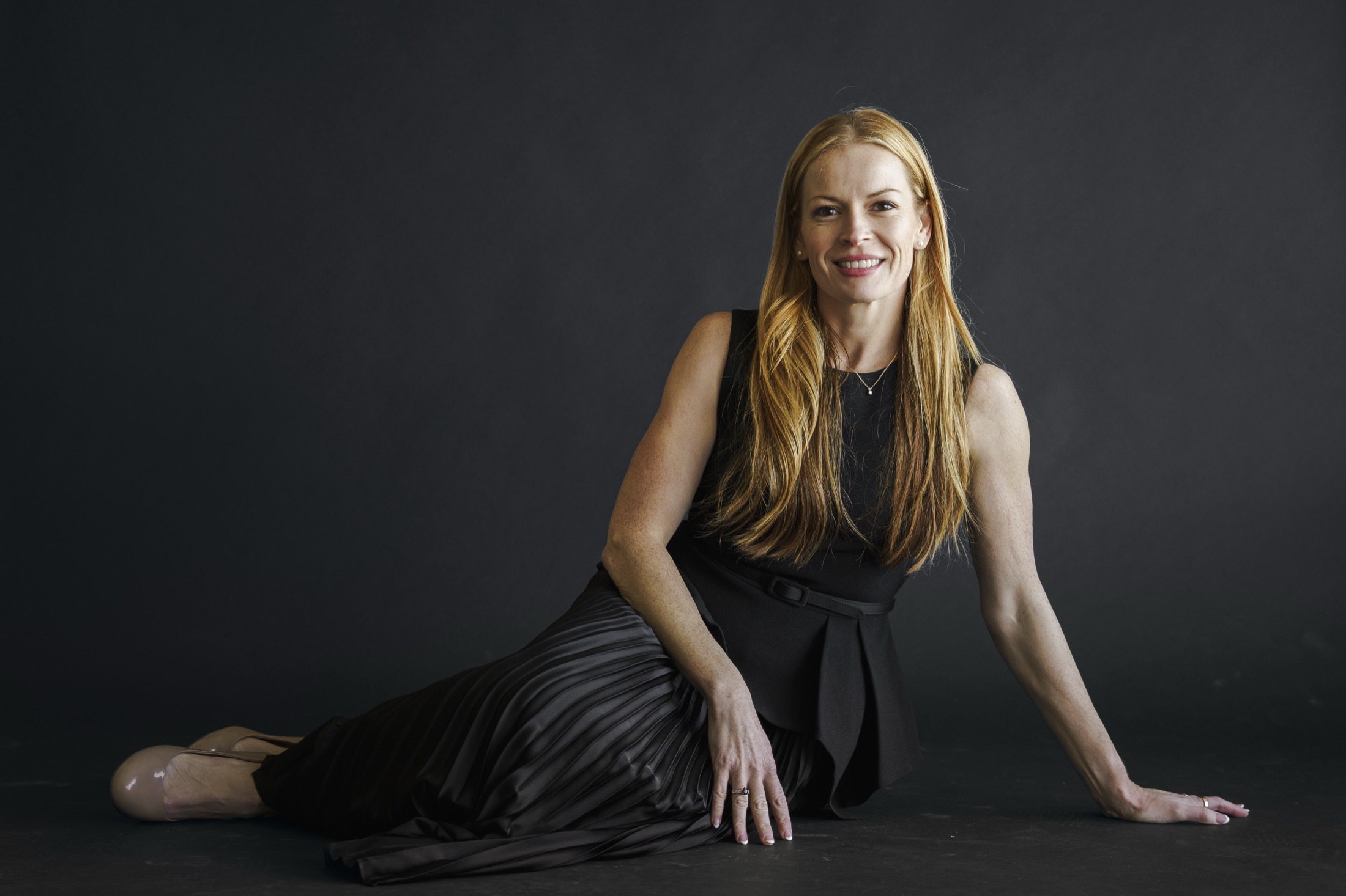
I'm Steph. A mom, entrepreneur, and Ironman athlete who has been building businesses in real estate for the last 12 years and leveraging AI since 2020. Now I run my whole business on AI — and with TrafficMaxxing, my content engine runs yours too: we research, script, edit, and post for you every single day, so more people know about your stuff, and more people buy.